
How to Read Forex Charts: The Ultimate Beginner’s Guide
If you’re diving into forex trading for the first time, staring at a forex chart can feel overwhelming. The lines, colors, and candlestick patterns may seem like a foreign language, leaving you unsure of what you’re really looking at. You’re not alone. Many traders share the same confusion when they start.
But here’s the good news: learning how to read forex charts is much simpler than it seems. Think of it like learning to read a weather map. At first, the symbols may look random, but once you understand the basics of trading forex, patterns will start to jump out at you.
This guide explains how to read forex charts step-by-step, so beginners can understand price movement, compare chart types, and start analysing forex charts with more confidence.
What Does a Forex Chart Show?

A forex chart provides a visual representation of how a currency pair’s price changes over time. The vertical axis shows the price – how many units of one currency are required to purchase another, and the horizontal axis shows time.
For example, when viewing EUR/USD at 1.0850, it means one euro costs $1.0850. If the chart moves upward, the euro is strengthening against the dollar. If it moves downward, the dollar is gaining value.
Forex charts are important because the currency market is the largest financial market in the world. According to the BIS Triennial Central Bank Survey, OTC FX trading reached around $7.5 trillion per day in April 2022. With so much activity across major, minor, and exotic currency pairs, charts give traders a structured way to read price behaviour instead of relying on guesswork.
How to Read Different Forex Charts?
Forex traders use different chart types depending on how much price detail they need. Line charts are useful for seeing the broader trend, bar charts show more price data, candlestick charts make buyer and seller pressure easier to read, and tick charts focus on market activity instead of fixed time periods.
Line Charts: Your Training Wheels
A line chart is the simplest type of forex chart. It connects closing prices over a selected timeframe, giving traders a clean view of the overall price direction.
Line charts are useful for beginners because they remove much of the short-term noise found in more detailed chart types. They can help traders quickly see if a currency pair is trending higher, trending lower, or moving sideways.
The limitation is that line charts only show closing prices. They do not show the open, high, or low for each period, so traders miss important details about intraday price movement. For long-term trend review, line charts can be useful. For more precise trade analysis, traders usually move to bar charts or candlestick charts.
Bar Charts: The Old-School Favourite
A bar chart gives traders a more complete view of price movement. Each bar shows the high, low, open, and close for a specific period.
The vertical line shows the full price range. The small horizontal mark on the left shows the opening price, while the mark on the right shows the closing price. This helps traders see not only where the price ended, but also how far it moved during that period.
Bar charts were widely used by professional traders before candlestick charts became more popular. They are still useful, but many beginners find candlesticks easier to read at a glance.
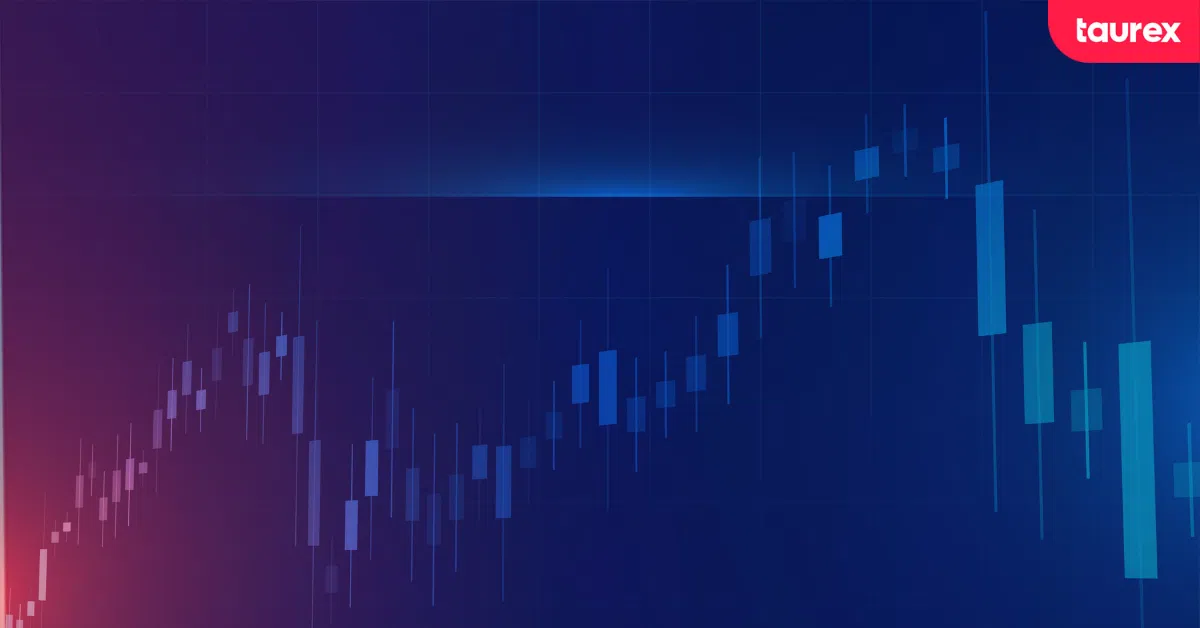
Candlestick Charts: The Trader’s Choice
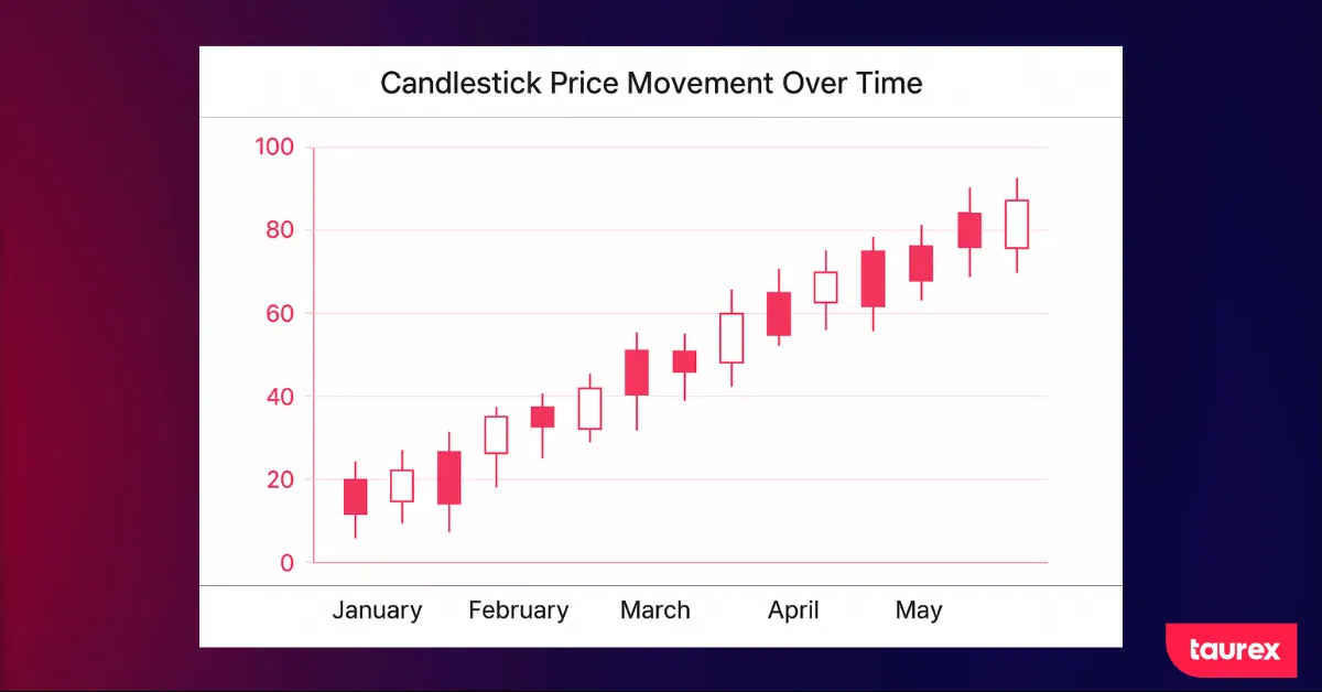
Candlestick charts show the same open, high, low, and close data as bar charts, but in a more visual format. Each candle has a body showing the open-to-close range and wicks showing the highest and lowest prices reached during the period.
A green or white candle usually means the price closed higher than it opened, showing buyer control. A red or black candle usually means the price closed lower than it opened, showing seller control.
This is why candlestick charts are so popular in forex trading. They help traders read price direction, momentum, and market psychology quickly. A long bullish candle with small wicks can show strong buying pressure, while a small candle with long wicks can suggest hesitation or indecision.
Mountain Charts: Pretty But Pointless
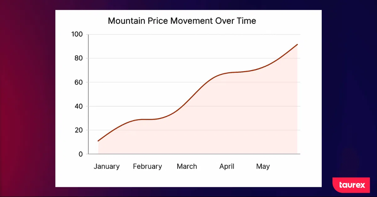
A mountain chart is similar to a line chart, but the area below the line is filled in. This makes it visually appealing, especially in reports or presentations.
For trading decisions, however, mountain charts offer limited extra value. They show the general direction of price, but they do not provide the detailed open, high, low, and close information that traders get from bar or candlestick charts.
Candlestick Patterns That Actually Matter
Candlestick patterns reveal how buyers and sellers interact during each trading period. While no pattern can guarantee a specific outcome, certain formations appear often enough to provide valuable insight into potential market direction.
Single Candle Signals
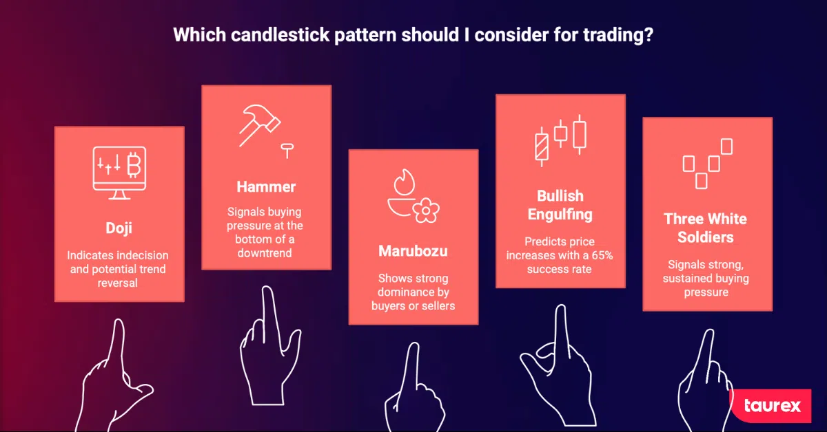
A doji represents indecision. The opening and closing prices are almost the same, forming a cross or plus-shaped candle. When it appears after a strong trend, it can indicate that momentum is fading and a possible reversal may be near.
A hammer has a small body near the top and a long lower wick. When it forms at the bottom of a downtrend, it often signals buying pressure returning to the market. Sellers pushed the price down, but buyers managed to bring it back up by the close. That was a sign of shifting control.
A marubozu is a full-bodied candle without wicks, where one side dominates the price action. A green marubozu indicates higher buying activity during the period, while a red one indicates higher selling activity.
Two-Candle Combinations
A bullish engulfing pattern forms when a smaller bearish candle is followed by a larger bullish candle that covers the previous candle’s body. It can suggest that buyers have taken control after sellers were previously dominant.
The opposite setup is a bearish engulfing pattern, where a larger bearish candle covers the previous bullish candle. This can suggest stronger selling pressure and a possible shift lower.
Engulfing patterns are more useful when they appear near key support or resistance levels, not in random areas of the chart.
Multi-Candle Patterns
The three white soldiers pattern pattern features three consecutive green candles, each opening within the body of the previous one and closing near its high. This pattern signals strong, sustained buying pressure and often appears at the beginning of a trend reversal from bearish to bullish conditions.
No pattern is foolproof. Candlestick signals can fail, especially during periods of high volatility or around major news events. Continually evaluate patterns in context. Consider the timeframe, nearby support and resistance levels, and the overall market trend before making a trading decision.
How to Choose The Right Timeframe For Your Trading Style?
A forex chart timeframe shows how much price action each candle, bar, or data point represents. A 1-minute chart shows very short-term movement, while a daily or weekly chart shows the broader market trend.
The right timeframe depends on your trading style, how often you want to trade, and how much market noise you are comfortable analysing.
| Trading Style | Common Timeframes | Best For |
| Scalping | 1-minute to 15-minute charts | Very short-term trades and fast entries |
| Day trading | 15-minute to 1-hour charts | Intraday setups without holding overnight |
| Swing trading | 4-hour to daily charts | Trades held for several days |
| Position trading | Weekly to monthly charts | Long-term market trends |
Scalping and Day Trading: 1-Minute to 1-Hour Charts
Scalpers and day traders usually focus on shorter timeframes, such as 1-minute, 5-minute, 15-minute, and 1-hour charts. These charts show fast price movement and can help traders find short-term entries during active market sessions.
Short-term charts are most useful when liquidity is high and spreads are tighter, especially during active forex market hours such as the London and New York session overlap.
This style requires fast decision-making, strict forex risk management, and close attention to spreads, volatility, and execution.
Swing Trading: 4-Hour to Daily Charts
Swing traders usually use 4-hour and daily charts to find setups that may last several days. Many swing traders also wait for the price to move back toward a key level before entering, where a pullback trading strategy can help confirm entries near support, resistance, or the broader trend direction.
Daily charts are often easier for beginners because they reduce short-term noise. Support and resistance levels are usually clearer, and traders do not need to watch the screen constantly.
For many beginners, the daily chart is a practical starting point because it gives enough time to analyse the market before making a decision.
Position Trading: Weekly to Monthly Charts
Position traders focus on weekly and monthly charts. These timeframes show long-term market direction and are usually used for trades held over weeks or months.
This approach requires wider stop losses, more patience, and a stronger understanding of macroeconomic trends. The benefit is that traders spend less time reacting to short-term price movement and more time analysing the broader trend.
Using Multiple Timeframes Together
Professional traders rarely rely on one chart timeframe. This top-down process is part of broader forex technical analysis because it combines trend direction, support and resistance, timeframe context, and confirmation signals.
For example, a swing trader may start with the weekly chart to understand the broader trend. Then they may check the daily chart to see if the price is approaching a key level. Finally, they may use the 4-hour chart to refine the entry with a confirming pattern or indicator signal.
A simple guideline is to keep timeframes around 1:4 to 1:6 apart. For example, if the main setup is on the 4-hour chart, the daily chart can provide context, while the 1-hour chart can help with entry timing.
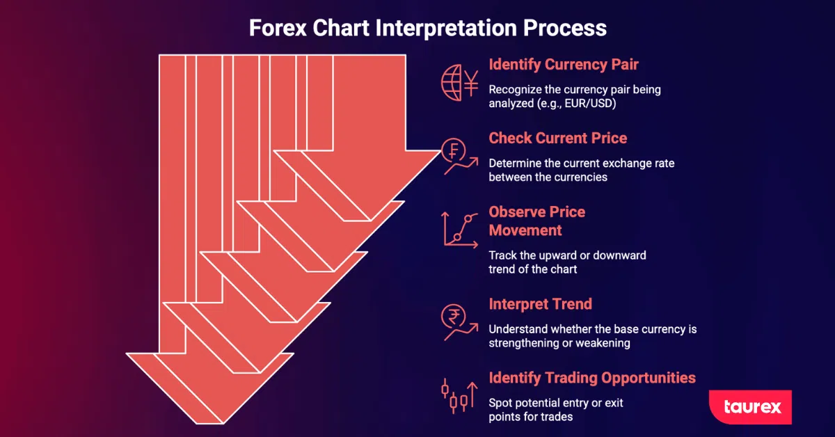
Support And Resistance: The Backbone Of Chart Analysis
Support and resistance are among the most essential concepts in trading. These are the levels where price tends to pause, bounce, or reverse. Understanding them is essential for reading charts effectively.
What Creates These Levels?
Support forms where buyers consistently enter the market, believing the price represents value. Resistance forms where sellers step in, seeing the price as too high. These levels reflect introductory market psychology.
For example, if EUR/USD bounces off 1.0800 multiple times, traders begin to notice. Some places buy orders just above that level, anticipating another bounce. Others set stops slightly below it. Over time, the level strengthens. The more often price tests it without breaking, the more significant it becomes.
Finding These Levels On Your Charts
Start with previous highs and lows. If the price reversed there before, it may do so again. Round numbers, such as 1.1000 or 1.2000, also serve as psychological levels where traders place orders.
Some traders also use Fibonacci retracement levels to map possible support and resistance zones during market pullbacks.
Round numbers, such as 1.1000 or 1.2000, can also act as psychological support or resistance because many traders place orders around clean price levels.
Moving averages can act as dynamic support and resistance. For example, the 50-day and 200-day moving averages are commonly watched because price often reacts around them during trending markets.
Trendlines can also help identify support and resistance. In an uptrend, a trendline connects higher lows and may act as support. In a downtrend, a trendline connects lower highs and may act as resistance, which is why many traders include trend line trading in their chart analysis.
Trading Strategies Using Support And Resistance
Bounce trading is straightforward. When the price approaches support in an uptrend, look for bullish candlestick patterns or indicator confirmations to enter long. Place a stop just below support and target the next resistance level. Reverse this approach when trading off resistance in a downtrend.
Breakout trading focuses on price movements around key levels. A breakout occurs when the price moves beyond a major support or resistance level, often followed by continued activity in the same direction. A cautious approach is to wait for a retest of the broken level (old resistance becomes new support) before entering.
Range trading occurs when price moves between defined support and resistance levels. Traders observe how price reacts near these levels and monitor for potential breaks outside the range.
How to Read Forex Charts with the Help of Technical Indicators?
Charts show price action, but indicators provide confirmation. They act as a second opinion on what the chart reveals.
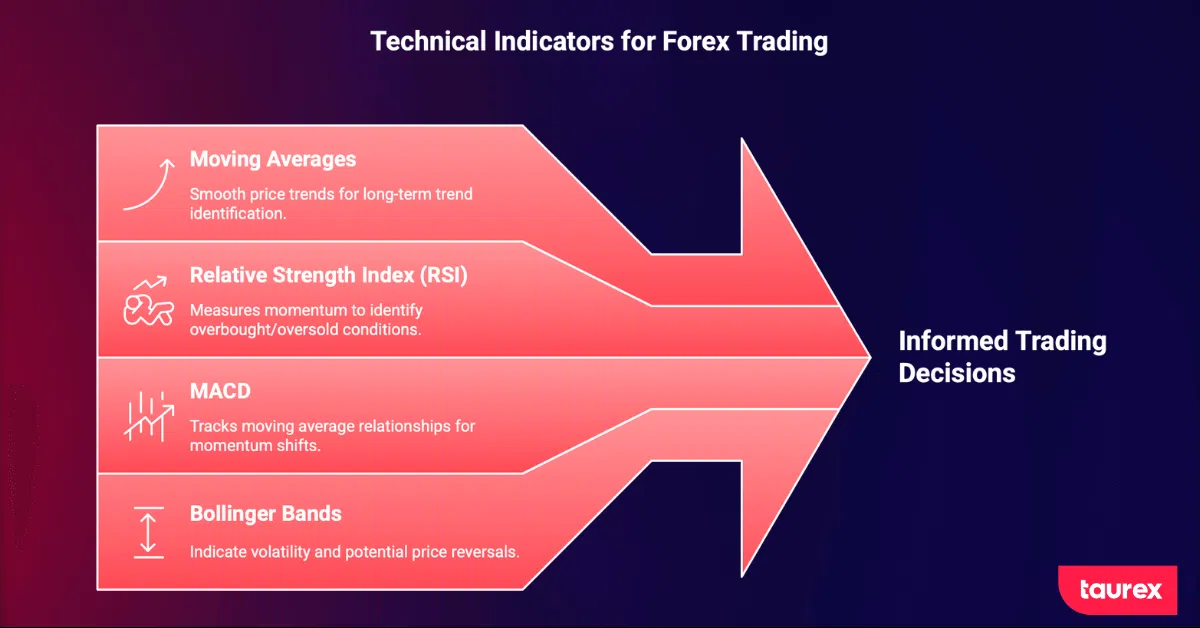
Moving averages smooth out price movements to highlight the underlying trend. When the price is above the 200-day moving average and the line is rising, it indicates a long-term uptrend. This simple tool is highly effective for trend identification.
The Relative Strength Index (RSI) measures momentum. A reading above 70 suggests overbought conditions, while a reading below 30 indicates oversold conditions. These levels can signal potential entries, but strong trends may remain overbought or oversold for extended periods. For a more advanced technique using RSI, explore our guide to divergence strategy, which shows how to spot opportunities when price and momentum indicators move in opposite directions.
MACD (Moving Average Convergence Divergence) tracks the relationship between two moving averages. A cross of the MACD line above the signal line often signals a buying opportunity. A cross below may indicate a sell. MACD is helpful for spotting momentum shifts before they appear clearly on price charts.
Bollinger Bands expand and contract with volatility. When the bands tighten, a significant price move is often imminent. A price touching the upper band in a range-bound market can signal a potential reversal. In strong trends, the price may ride the bands for an extended period.
Best Practices for Using Indicators
Use only two or three indicators at most. Too many indicators can create conflicting signals and make the chart harder to read.
A simple setup may include:
| Indicator Type | Example | Purpose |
| Trend indicator | Moving average | Shows market direction |
| Momentum indicator | RSI or MACD | Confirms strength or weakness |
| Volatility indicator | Bollinger Bands | Shows volatility expansion or compression |
The goal is not to find a perfect indicator combination. The goal is to use indicators as confirmation, while price action, support and resistance, timeframe, and risk management remain the foundation of chart analysis.
Common Forex Chart Reading Mistakes That Will Cost You Money
New traders often make the same chart-reading mistakes: they chase price, ignore the bigger trend, use too many indicators, or change timeframes when a trade starts moving against them. These habits are part of broader forex trading mistakes that can make analysis less consistent and increase risk.
Trading against the trend is the fastest way to lose money. Picking tops and bottoms may feel clever when it works, but the saying “the trend is your friend” exists for a reason. Until you can trade with the trend consistently, avoid fighting it.
Failing to manage risk can quickly deplete your account. No matter how skilled you become at chart reading, losing trades are inevitable. Always use stop losses. Limit risk to 1–3% of your account per trade. This approach may seem cautious, but it preserves capital and keeps you in the market long enough to improve.
Jumping timeframes to justify a losing trade is self-sabotage. Entering on a 15-minute chart and then switching to the daily chart when the price moves against you can be costly. Pick a timeframe and follow it consistently.
Information overload is a genuine challenge. Focus on mastering one currency pair, one timeframe, and one or two strategies first. This will reduce errors and help you make better trading decisions.
How Market Psychology Appears on Forex Charts
Forex charts do not only show price movement. They also reflect how buyers and sellers behave at different price levels. Every candle, wick, breakout, and reversal shows a shift in confidence, fear, greed, hesitation, or pressure in the market. Emotional reactions like FOMO in forex trading can also push traders to enter too late or react without confirmation.
A long upper wick on a candle represents more than price movement. It shows buyers pushing the price higher, encountering strong selling pressure, and retreating. This rejection indicates that sellers are defending that level.
Candlestick patterns reveal market psychology. A doji after a strong trend shows indecision, when bulls and bears are equally matched, and neither side can gain control. An engulfing pattern shows one side gaining decisive control, indicating a shift in market power.
Understanding these dynamics helps anticipate price action. Long red candles with rising volume suggest panic selling, often signalling a peak in fear. Small, indecisive candles after a rally indicate that enthusiasm is fading and may be a time to consider taking profits.
Market Conditions Matter More Than Patterns
The same chart pattern can produce very different results depending on market conditions. A reversal pattern in a strong trend is not the same as a reversal pattern near support in a ranging market.
In a strong trending market, focus on continuation patterns and pullbacks to support and resistance. Reversal patterns in these conditions are less reliable. The trend often overrides them.
In a ranging market, those reversal patterns become more effective. Price moves predictably between support and resistance, allowing traders to take both long and short positions with greater confidence.
Market context starts with a simple question: is price trending or moving sideways? An uptrend usually shows higher highs and higher lows. A downtrend shows lower highs and lower lows. A range shows price moving between repeated support and resistance zones. If price breaks beyond that range, traders may use a structured setup like the ORB trading strategies to confirm the move.
Volatility in forex also matters. During major economic releases or geopolitical events, spreads can widen, slippage can increase, and chart signals can become less reliable. Under those conditions, waiting for the price to stabilise is often better than forcing a trade based on a pattern alone.
Your Trading Toolkit with Taurex
Reading forex charts becomes easier when you can apply the concepts directly on a live platform. Taurex gives traders access to charting tools through MetaTrader 4 and MetaTrader 5, so they can analyse price movement, compare timeframes, apply indicators, and monitor currency pairs in real time.
Traders can use chart types, technical indicators, drawing tools, and price alerts to study trends, support and resistance, candlestick behaviour, and market conditions. This makes it easier to move from theory to practical chart analysis.
Taurex also supports market research tools such as Trading Central and real-time market updates from Acuity, which can help traders understand the context behind price movements and technical setups.
For beginners, a demo trading account is the safest place to practise reading forex charts. It allows traders to test chart patterns, indicators, timeframes, and risk management without using real funds. Combined with educational resources from Taurex Academy, traders can build chart-reading skills step by step.
FAQ
How can beginners read forex charts?
Beginners should start by choosing a currency pair, chart type, and timeframe. Then they should check the overall trend, mark support and resistance levels, and study how candles behave around key price zones. Indicators can help confirm the analysis, but price action should come first.
What is the easiest forex chart to read?
A line chart is the easiest forex chart to read because it shows the general price direction clearly. However, candlestick charts are more useful for trading because they show the open, high, low, and close of each period, along with buyer and seller pressure.
How do you interpret forex charts?
To interpret a forex chart, look at price direction, trend structure, support and resistance, candlestick behaviour, and market conditions. If price is making higher highs and higher lows, the market is in an uptrend. If price is making lower highs and lower lows, the market is in a downtrend.
What timeframe is best for reading forex charts?
The best timeframe depends on trading style. Scalpers often use 1-minute to 15-minute charts, day traders use 15-minute to 1-hour charts, swing traders use 4-hour and daily charts, and position traders use weekly or monthly charts. Beginners may find daily charts easier because they reduce short-term noise.
Can you see the actual number of buyers and sellers on a forex chart?
No, a standard forex chart does not show the exact number of buyers and sellers in the global forex market. Spot forex is decentralised, so there is no single central exchange showing total market volume. Traders usually read buyer and seller pressure through candlestick structure, wicks, support and resistance reactions, and price movement.

